For this project, I was tasked to create a music festival brand, including merchandise based on a music genre. I wanted to try something different, so I chose "Video Game Orchestra" as the theme. As I worked on the design, I decided to focus on a Nintendo music festival. This helped me build a brand that shows passion, creativity, nostalgia, and fun for both new and longtime Nintendo fans.
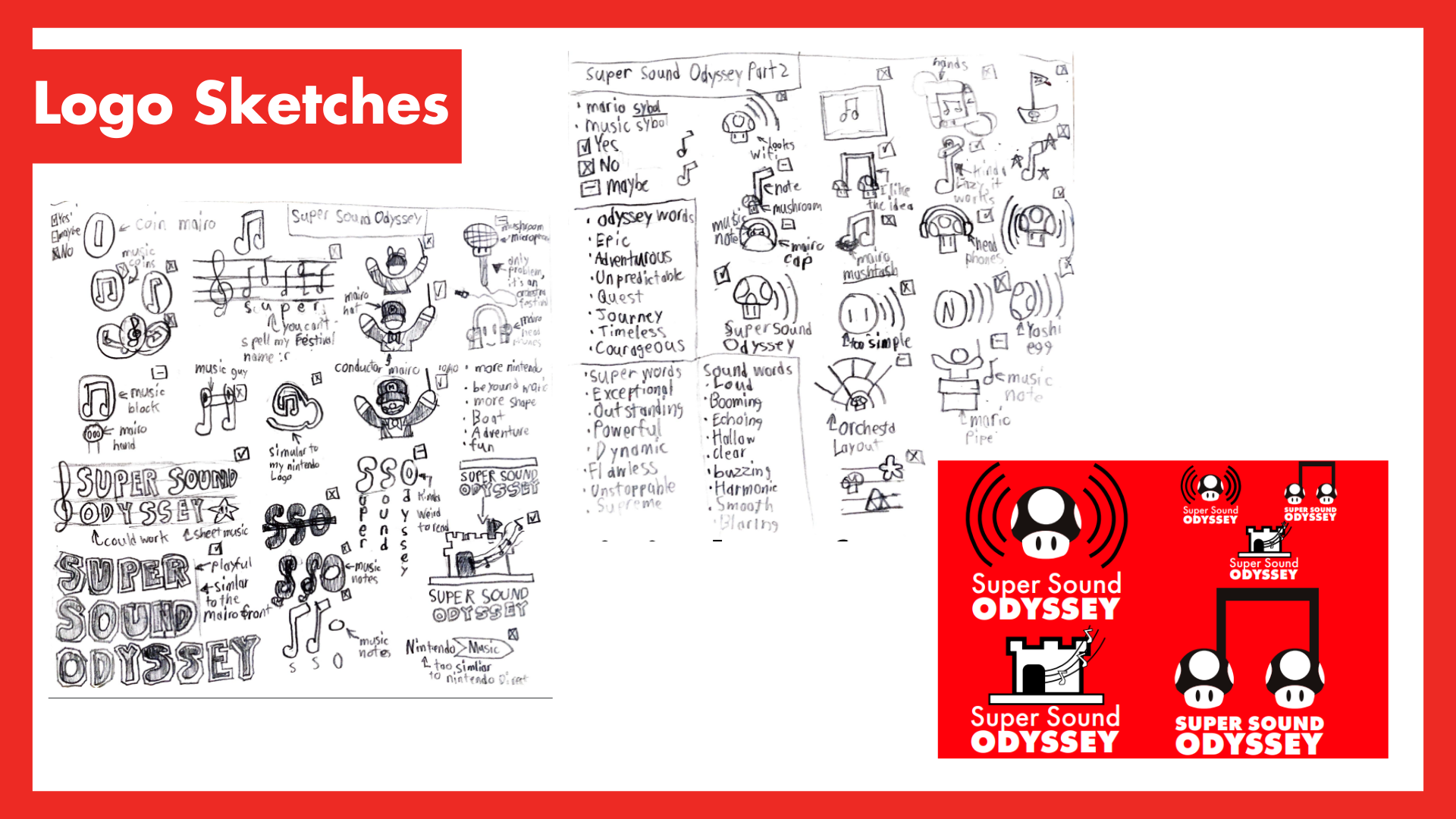
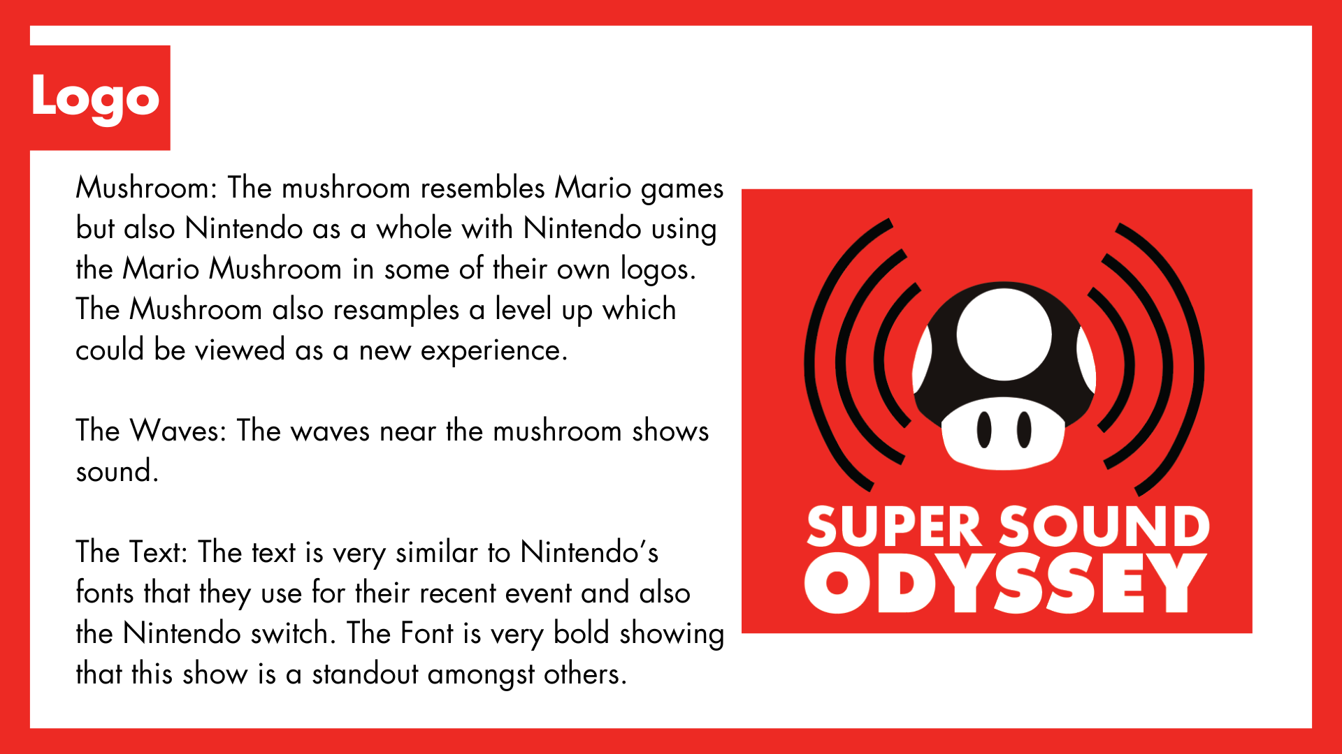
Making the logo took some time because I wanted to use Nintendo inspired elements without copying their old logos. In the final design, the mushroom stands for Mario and Nintendo as a whole. It also represents a "level up" or a new experience. The waves around the mushroom show sound and music, which ties into the festival theme. The bold text looks similar to the fonts used in Nintendo events and on the Switch, helping the logo stand out.
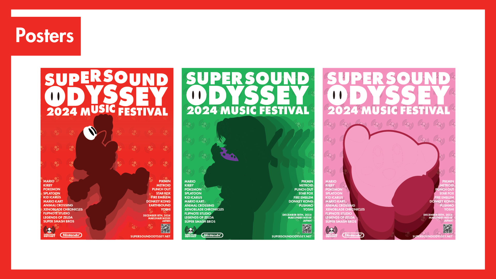
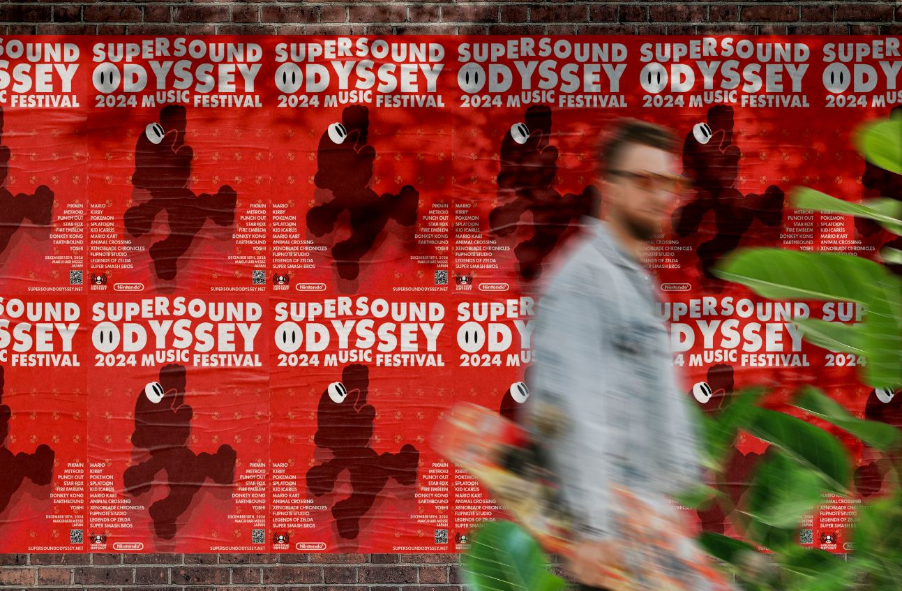
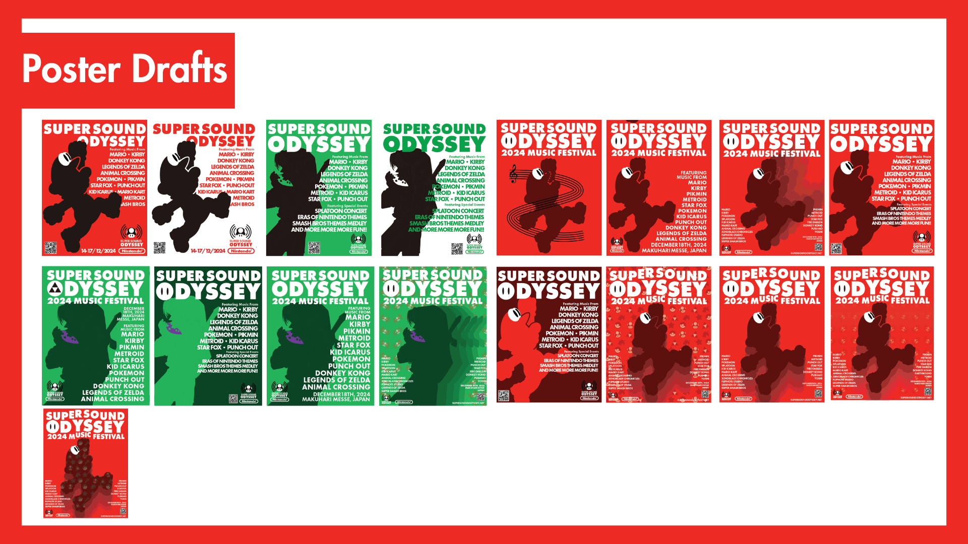
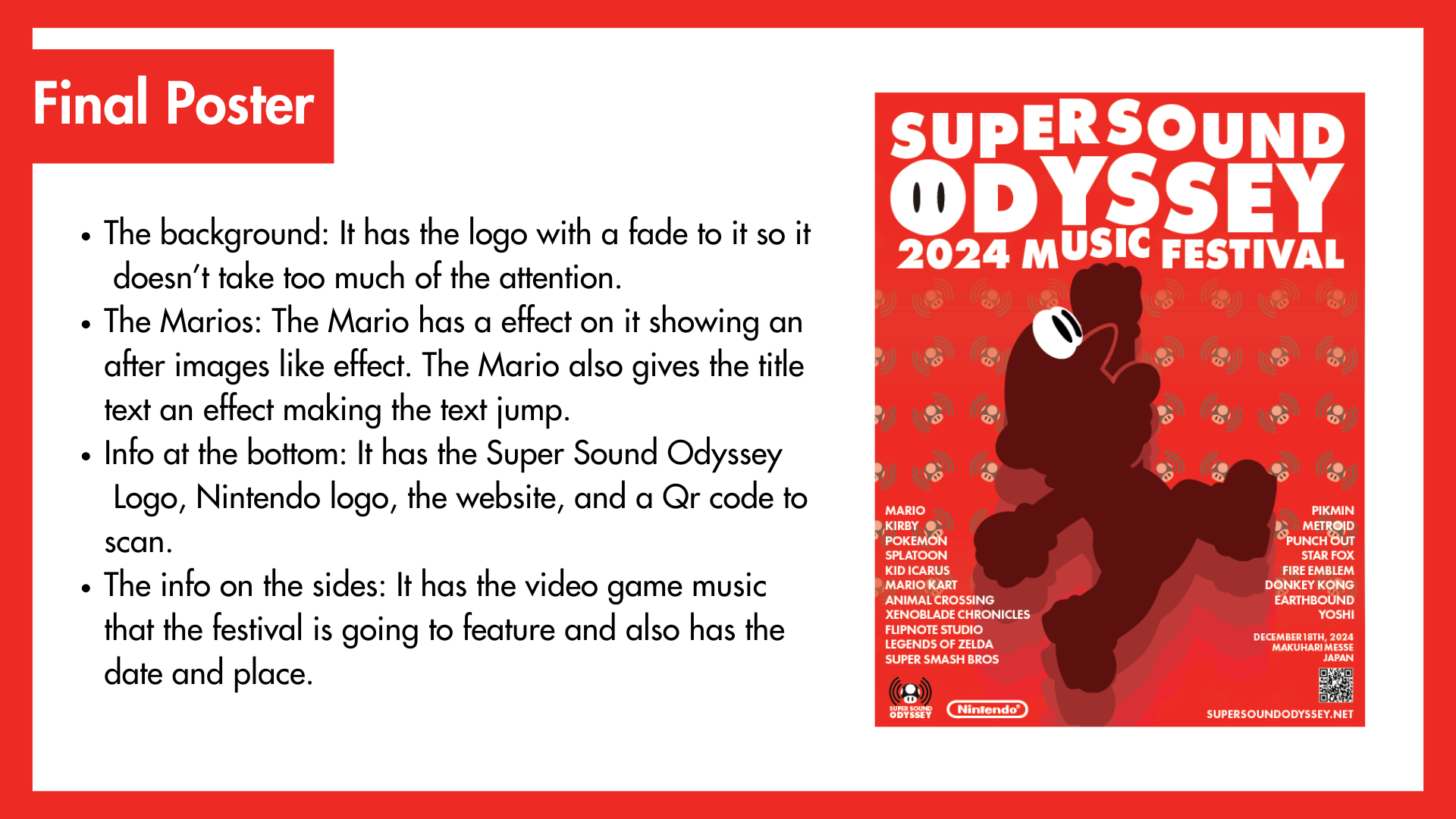
For the poster, I wanted it to be bold, with Mario as the main focus. The background has a faded version of the logo so it doesn't take too much attention. Mario has an afterimage effect, making it look like he’s moving and making the title text pop. At the bottom, there’s the Super Sound Odyssey logo, the Nintendo logo, a website, and a QR code. On the sides, there is info about the video game music featured in the festival, along with the date and place.
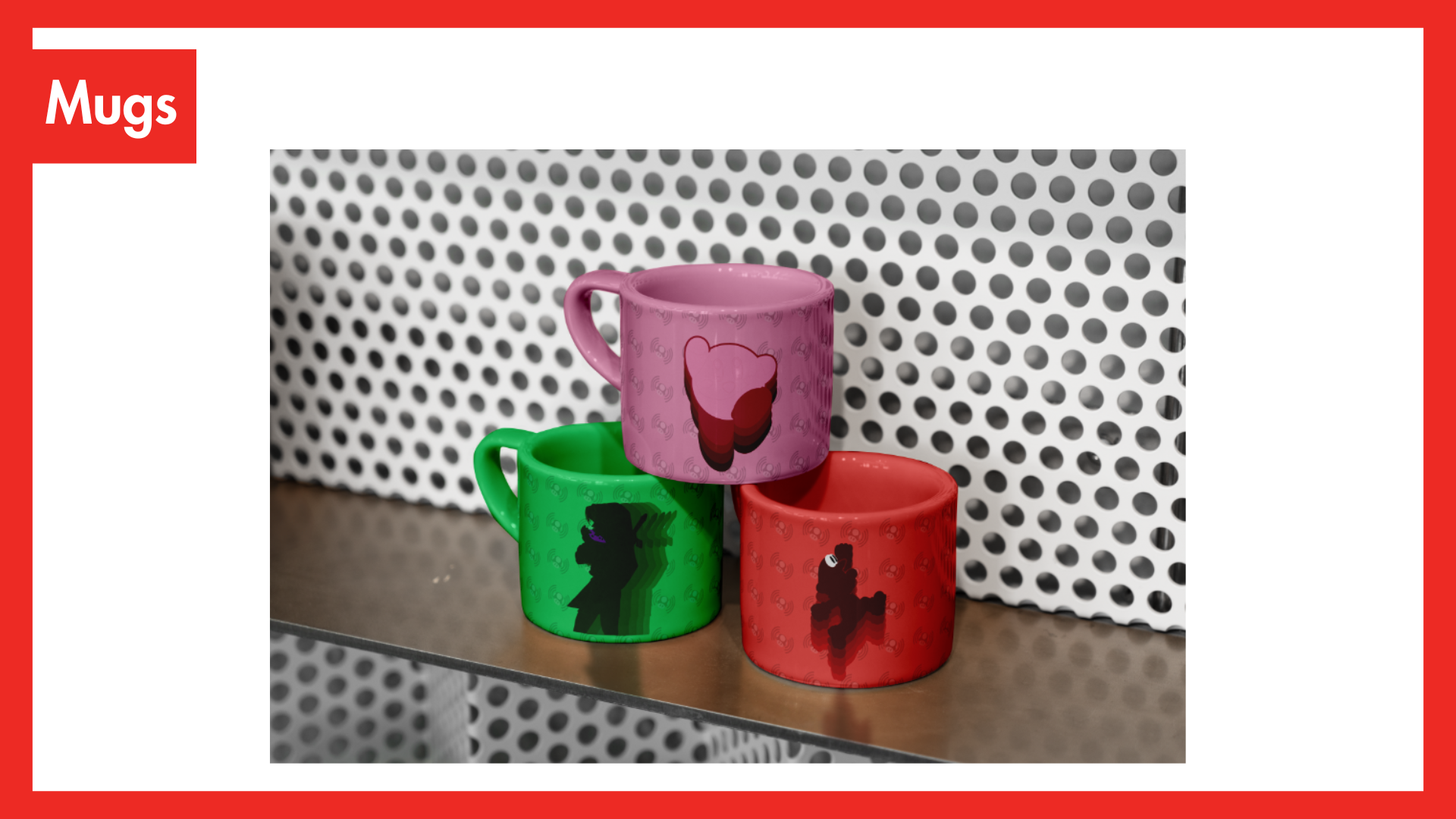
For the tickets and merchandise, I used the same design elements from the poster to keep everything matching. The tickets and merch include Mario, the logo, and the same bold text. The merch includes things you would usually find at a video game concert, music festival, or Nintendo event. My favourite item is a set of alternate posters that show different Nintendo characters like Link from The Legend of Zelda and Kirby from the Kirby series. Each one uses colors that match the character’s style.