For this project, I was asked to redesign the brand of a local mom-and-pop shop. This included a new logo, a set of stationery, and a website redesign. Finding a store to work with was easy for me because I chose a place I have known for a long time. I have good memories of talking with the store owner about anime and manga. During my research, I learned that the owner is a bit afraid of using social media and worries about getting bad reviews. So, I wanted to help solve that problem through this project.
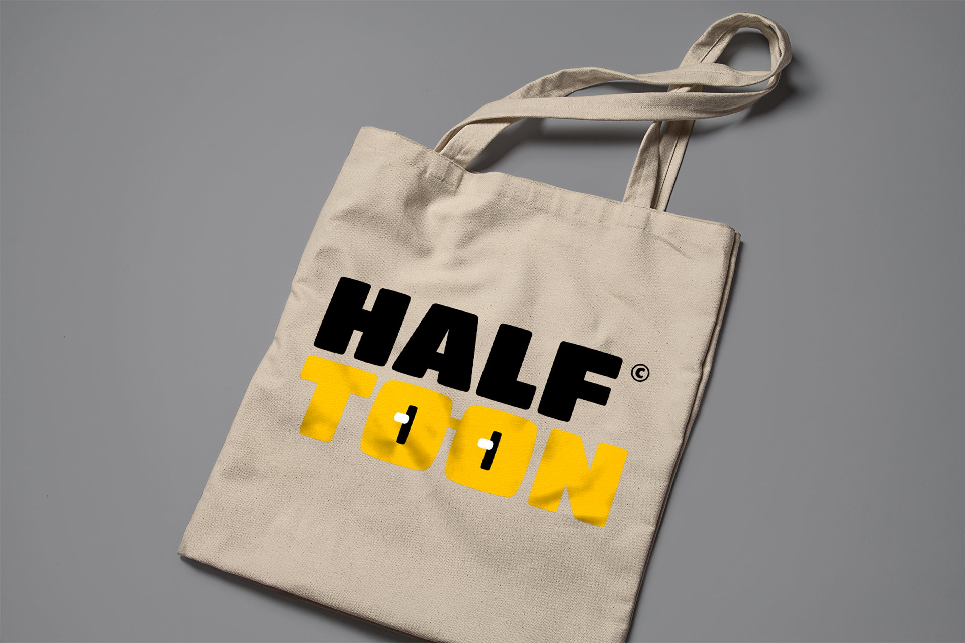
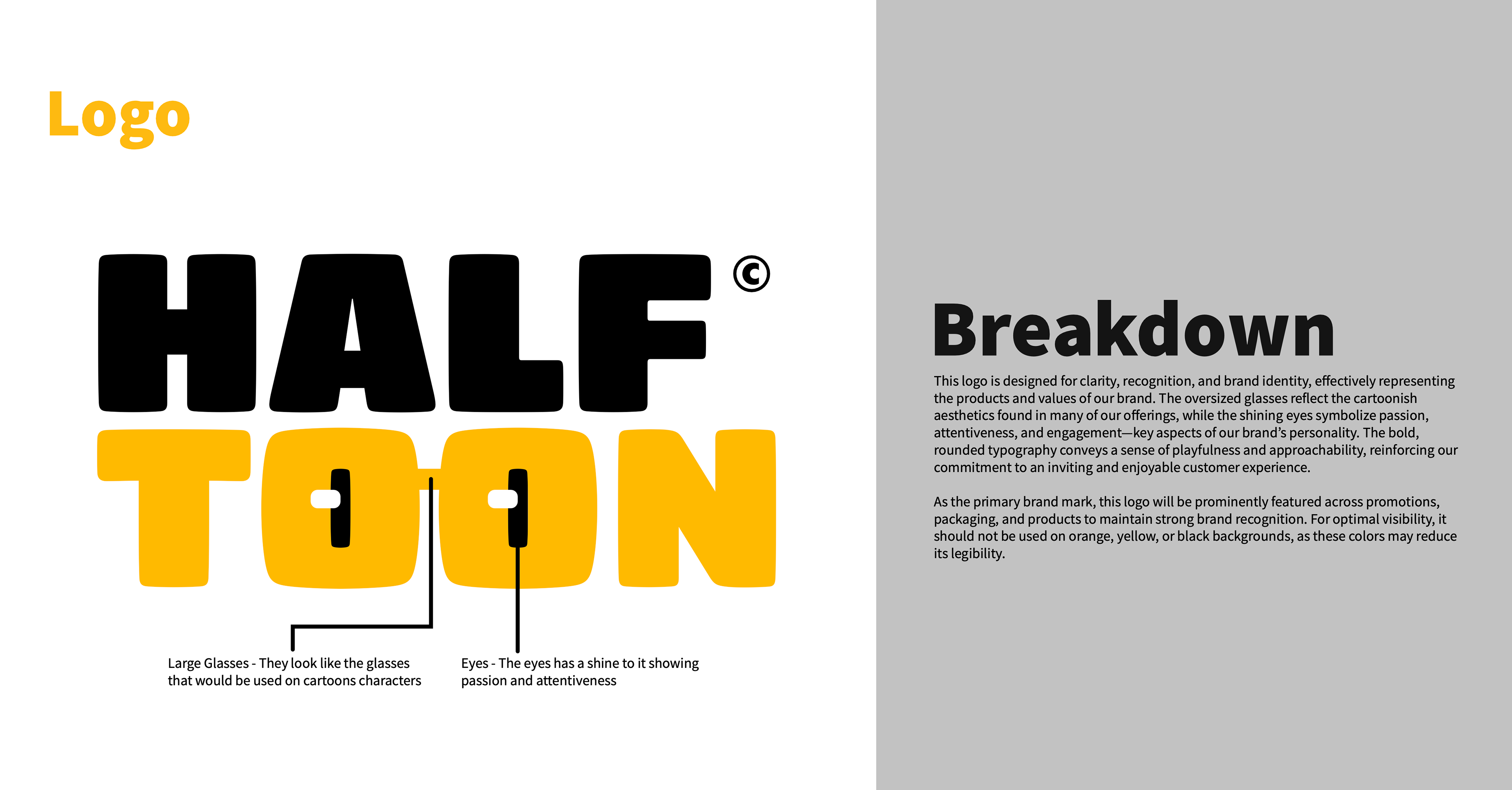
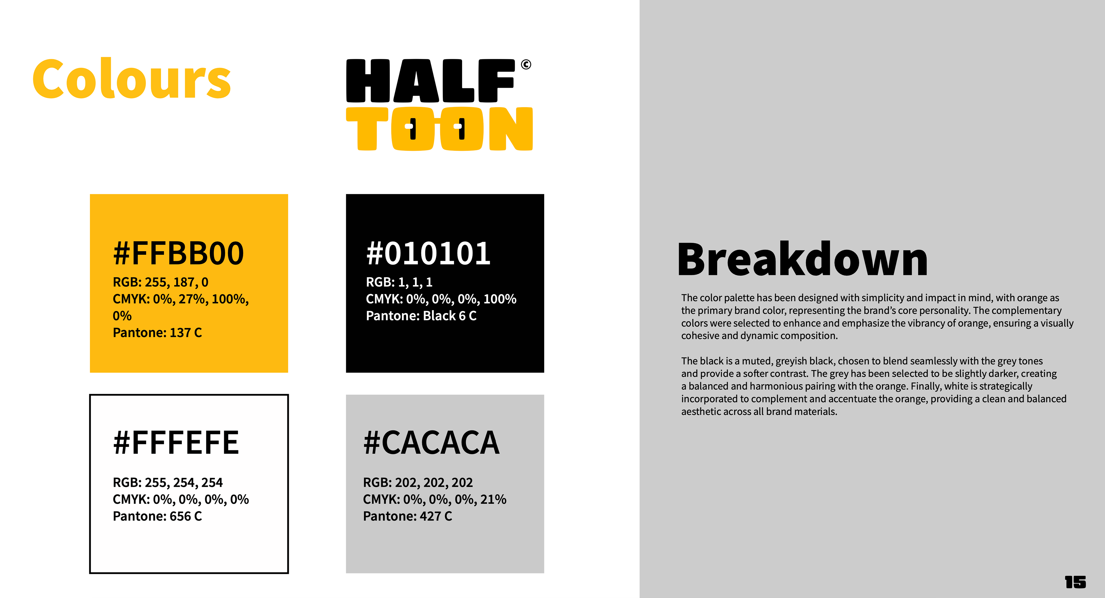
Designing the logo took about two weeks. The ideas started coming to me right after I came up with the brand name. The logo is meant to be both fun and bold so that customers will remember it. It works best with three main colour, but it was a bit tricky to create alternate versions that still looked good using the same colour style.
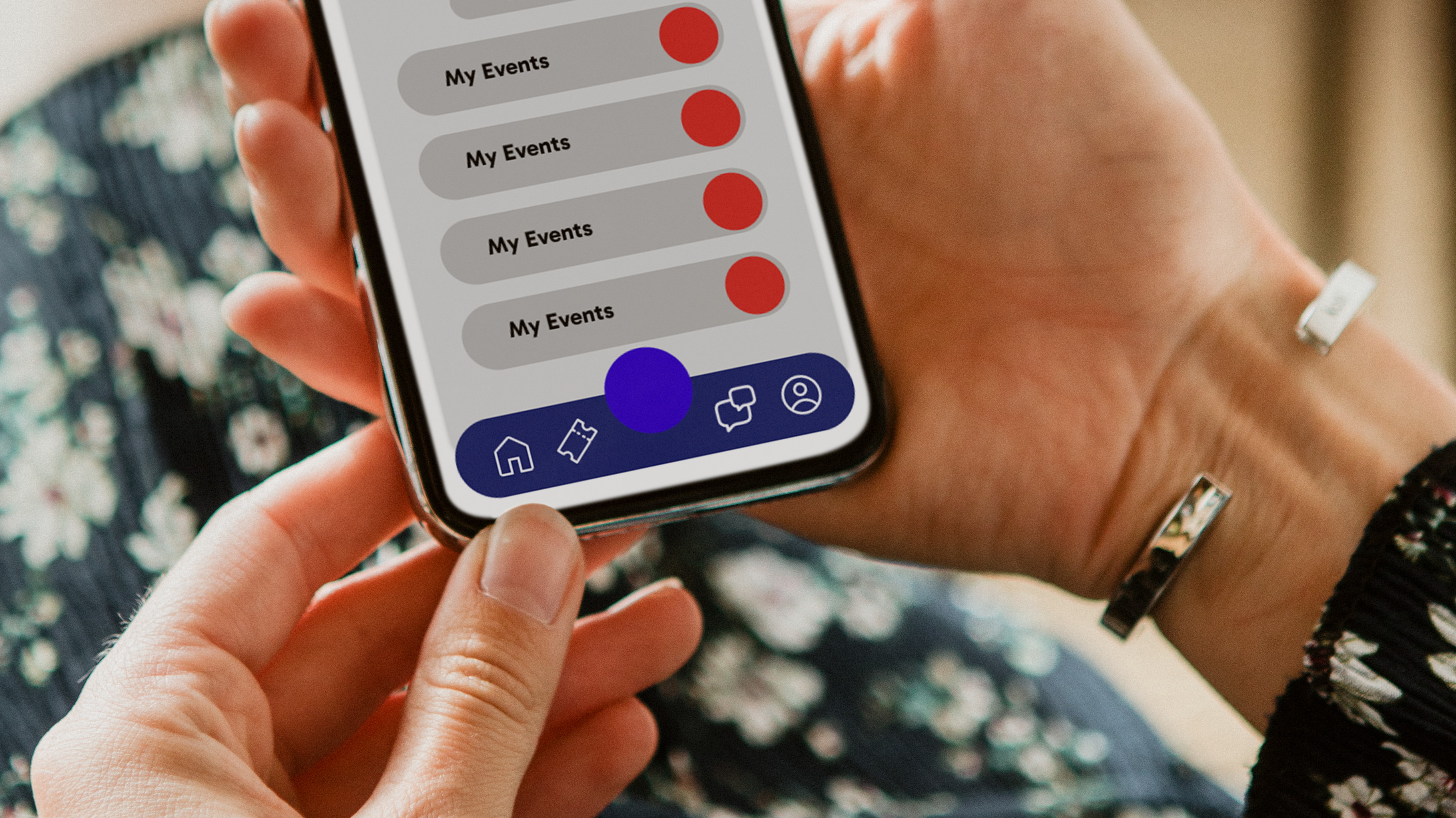
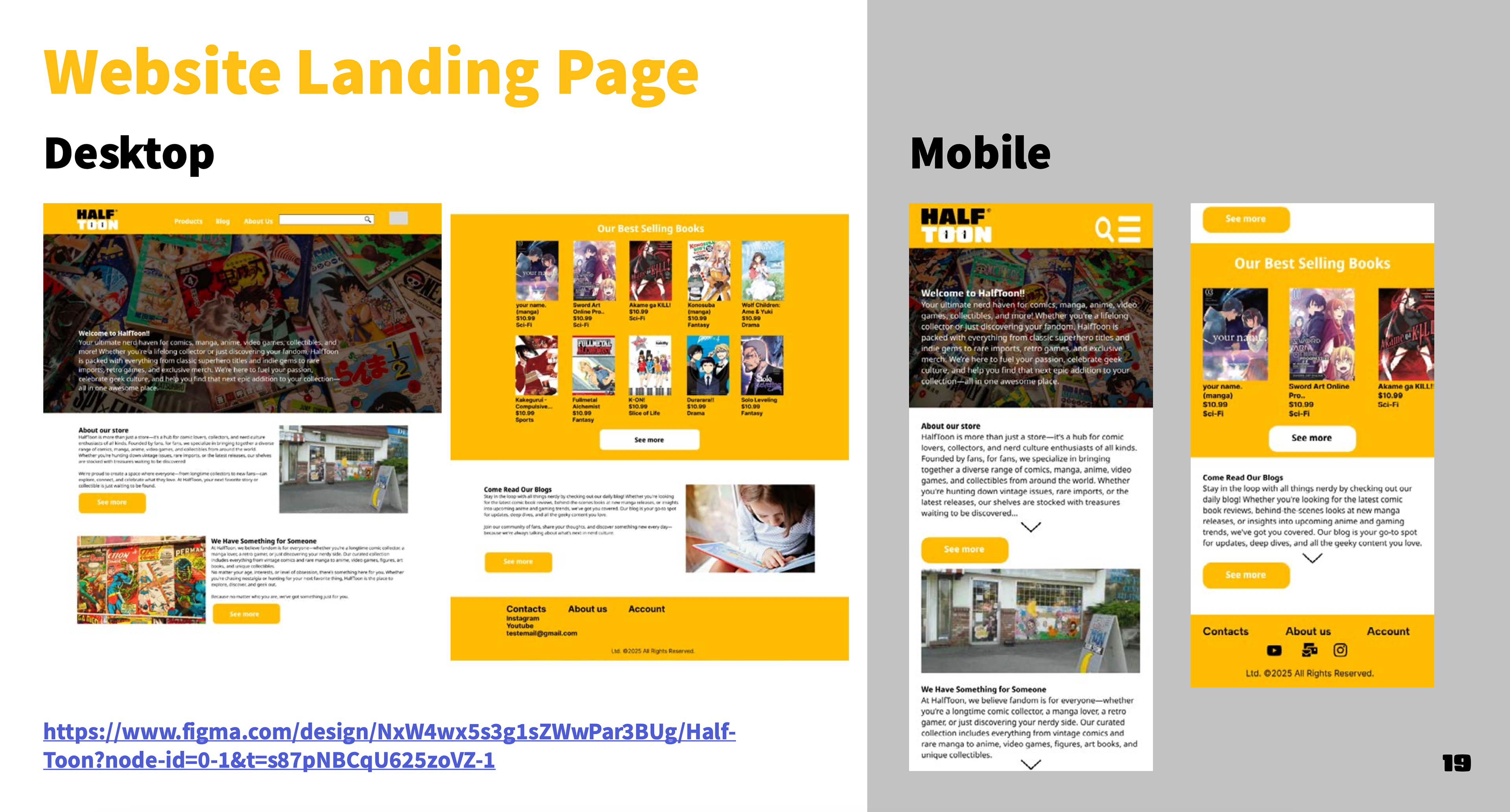
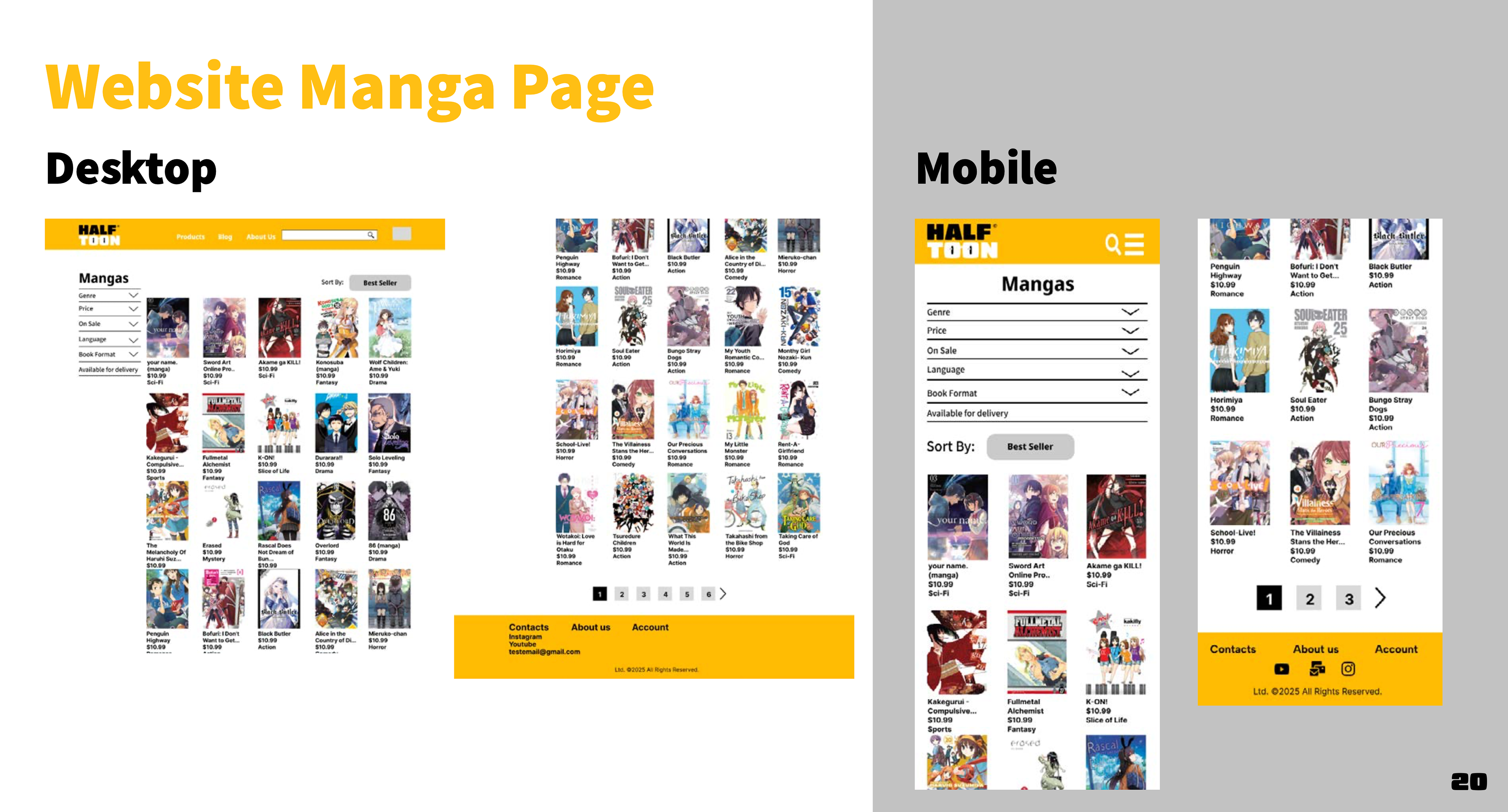
The website was the hardest part for me. It took just as long as making the logo. This was only my third time using Figma, so I had to learn new things like adding animations and creating layouts that work well on both desktop and mobile screens.
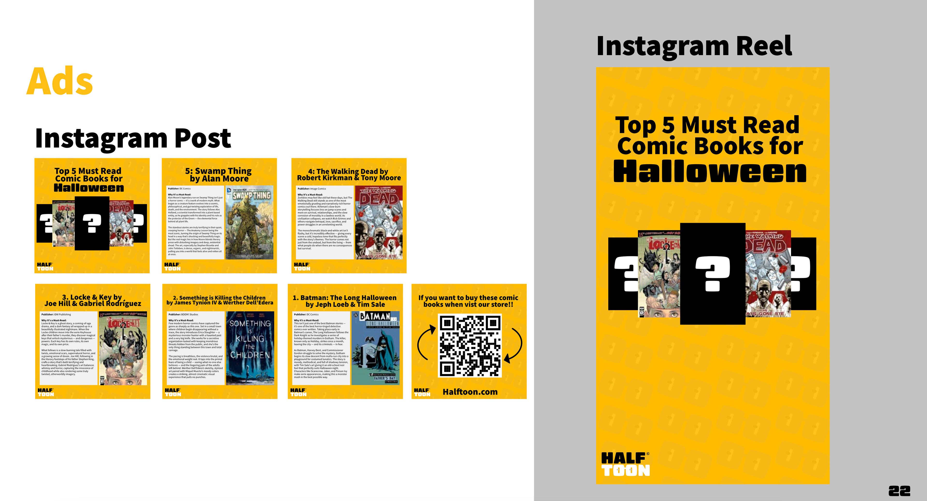
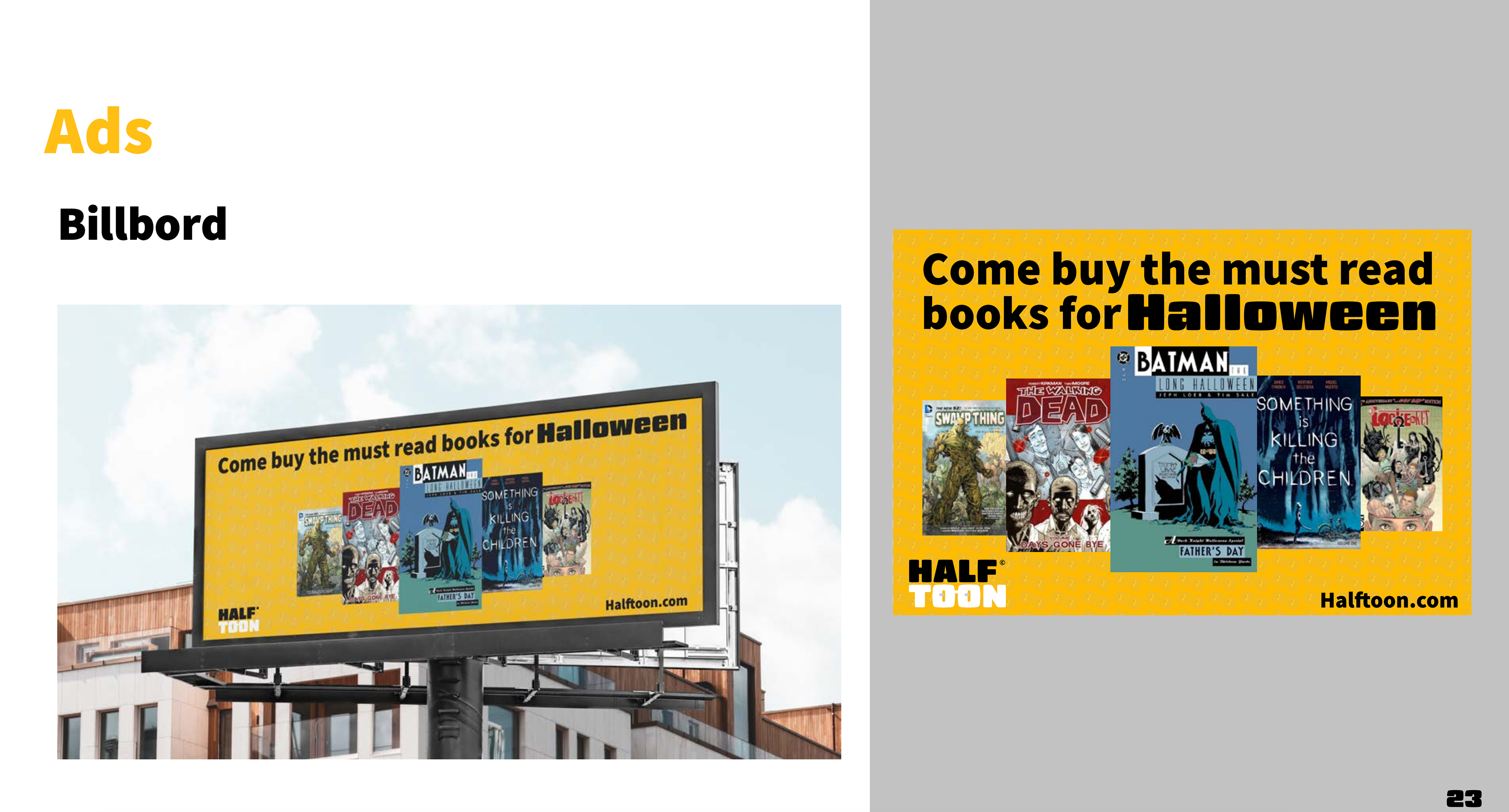
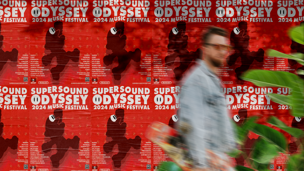
Making the ads was fun. However, there are some things I wish I had done better. For example, I should have added a note on the last slide telling people to click the link in the description. I also used too much text when talking about the books.